Two Big Reasons Your Dental Website Design Matters
Date: November 10, 2015Category: Author: David Hall
There are two big reasons that your dental website design is critical to your online marketing efforts. The first is because of its role in converting visitors into patients. Let me illustrate this with a case study.
Case Study #1
Early last year, we took on a new client that I will call Dr. H. Dr. H runs a high-end practice in a highly competitive urban market. He is AACD accredited. He described his target demographic as “higher income people, executives and professionals, people looking for that concierge level of dental care.” The procedures he said he most wanted to do were implants and cosmetic cases.
His website design, however, didn’t reflect the level of his practice. We suggested that he do a new design, but he wasn’t interested. He said he liked the design he had, it wasn’t that old, and he had spent quite a bit of money on it. In retrospect, we should have been more emphatic. If I had this situation all over again I believe I would insist on a new design as a condition of taking the client, because the existing design completely missed his target demographic. Subsequent events demonstrated that. As it was, we made our suggestions rather meekly. After all, he was also working with a local marketing consultant who seemed to have no problem with the design. It was a learning experience, the end result of which was to give us more confidence in our own judgment and a resolve to be more insistent the next time this situation arises.
Because of the nature of his practice, we chose “cosmetic dentist” as his primary search term. When we took over his website, he was showing up in the middle of page two on Google for the search term “cosmetic dentist” paired with his city. Over a year’s time, we were able to raise that ranking to #5—the middle of page one.
It wasn’t that long ago, maybe three or four years, that this strategy would have probably worked for him. That was part of our obstacle in dealing with the client. Several years ago he didn’t have a sophisticated design and his website drew in the patients he wanted. But searchers are getting more sophisticated and competition has gotten stiffer. Many cosmetic dentists are getting websites with sleek, sophisticated designs. Patients will look at several websites before choosing a dentist, especially a cosmetic dentist, and pick the one that impresses them the most.
After he had been at that ranking for about three months, we got an email from his office manager complaining about the nature of the clientele that were being attracted by the website. Their calls had increased, but they were getting patients with comments like these:
• Do you take my dental insurance? (I can’t pay anything out of pocket)
• I want an in-house payment plan (I have credit problems and can’t qualify for outside financing)
• $380 new patient fees are too high
• I need pain meds—have a broken tooth (have to be seen today)
• I’d like cheap dentistry or free (I have no money)
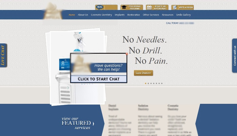
The problem, of course, was the design. Here is what the design looked like. (We have blurred out the name, location, and body text.)
The Role of Design in Conversion
Michael Andre is a marketing consultant that we work with who is an expert in neuromarketing—marketing to the subconscious. A winner of the Atticus award for excellence in marketing, he is a former managing director of the Grey Marketing Group, a global marketing firm out of Dusseldorf, Germany that managed a number of international dental and health care products. Among numerous other accomplishments, he crafted the highly successful recent advertising campaign to the public for Sensodyne toothpaste that increased its market share to record levels. We asked him to give his opinion of this design, given Dr. H’s target demographic and target procedures. Once he looked at this design, he didn’t hesitate. “The look misses it totally,” he said.
“What’s wrong with it?” we asked. “Everything,” he answered. While he is seeking high-end clients, it doesn’t have a high-end look. It’s too crowded. The logo (which we have blurred out to avoid identifying the dentist) doesn’t look expensive. The “Call Today” message in the upper right-hand corner conveys an eagerness that is not befitting a professional image. (Interestingly, we had removed that and replaced it with a simple “Call” message, but the client re-edited the page and put it back.) The floating invitation to chat that moves across the middle of the home page is also over-eager, besides being annoying. High-end patients generally don’t put up with those annoyances the way budget-conscious patients do. The most prominent messaging on the site (“No Needles, No Drill, No Pain”), which Dr. H insisted be placed in that most prominent position so that he could promote his laser dentistry, also helps convey a “blue collar” feel to the site.
So we had more than doubled Dr. H’s website traffic to a very high 4000 unique visitors per month. This increased his calls, but the patients who were influenced to call were budget-conscious and not looking for the smile makeovers and dental implants that Dr. H wanted to provide. Complicating the situation, we had written the text to attract the high-end clientele that he had told us he wanted. So there was a dissonance in the messaging of the website which may have resulted in filtering out some calls, leaving him with calls from those who either hadn’t read the text or didn’t fully digest its message.
In a less competitive market, this design may have worked, simply because of less sophisticated competition. If patients took the time to read into the website, they would discover outstanding credentials and a smile gallery that showed off Dr. H’s beautiful work. The problem is that other dentists in his market also had outstanding credentials, a beautiful smile gallery, plus a website that made a great first impression. Here is one of several examples of his competition (again, we have blurred out the name and location):
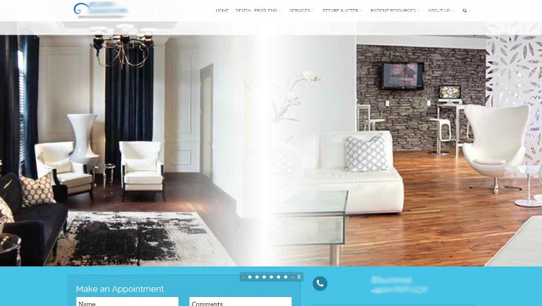
A patient seeking a smile makeover is looking for a dentist who will make her beautiful. Michael Andre emphasized this point in evaluating this website. The website design, he said, needs to convey beauty. And beauty, he said, always has to look expensive. Several competitor websites conveyed that beautiful, expensive feel.
Results of Our Research
Infinity Dental Web is continually conducting research with dental patients who find their dentist by searching on the Internet. When we question these patients, we first ask a very open-ended question about why they chose the dentist they did. Of those asked, 53% of the patients indicated that a significant part of their decision had something to do with the website design or the feeling conveyed by the design. When we discussed this number with Mr. Andre, he told us that the actual percentage of people who are influenced by the design would be much higher than that, because the impact of the design is largely subconscious. Patients will typically check three or four websites and call the dentist whose website impresses them the most. Those looking for higher-end services will generally check out more websites and be more discriminating than those who are just looking for a family dentist. A few years ago, people were more influenced by a number one ranking on Google. The audience, however, has matured, and patients seem less swayed by a number one ranking. Now, you just need to be close enough to the top that they find you and then have a website that will convert the visitor into a patient.
And the important thing to know about the conversion process is that the decision to call the dentist is both emotional and logical. (See an interesting post on this subject from the Cult Branding Company.) Neuroscientific research teaches us that purchasing decisions are actually made emotionally first and then the customer looks for logical reasons to validate that decision. So prospective patients will first be influenced by the design, and from there they will read through the website looking for logical justification for that emotional decision. For many patients, if you don’t make that emotional connection with your design first, the logic of what you say on the website won’t really matter.
The Second Reason Design Is Important
That’s the first reason that your website design is critical to your online marketing efforts—design has a strong impact on conversion. The second reason is simpler but also important—design has a strong impact on website ranking.
It didn’t used to be that way. Back before 2012, design had little or no impact on ranking. But with the Google Panda update, Google has been trying to incorporate “user experience” as a strong factor in its rankings. Google does not want search engine specialists to know much about its algorithms, to keep them from manipulating results. So while Google doesn’t admit it, it appears to many of those specialists that visitor time on site and bounce rate impact those rankings. We have several examples from our experience with clients that illustrate that a new design has clearly impacted their rankings on Google.
Let me give one brief case study for this point. We have a client we will call Dr. D who practices in a competitive suburban market. Back in 2011 (pre-Panda) we were able to get him up to a number one ranking for “cosmetic dentist” for his market. Then, in 2013, he dropped to #3. We told him that we believed the reason for the drop was that he had an old-fashioned design, and because of our experience with other clients we were confident that a redesign would bring him back up to #1. After a while, he finally relented and we did a beautiful new design that also had improved functionality. The result was not immediate, but in a few months he was back to a #1 ranking.
The bottom line—website design is crucial. You can’t get around it. It contributes both to visibility and conversion.
Leave a Reply