Google Begins Labeling Sites That Are Mobile-Friendly
Date: November 21, 2014Category: Author: Jaren Martineau
I noticed this past wednesday that Google began labeling websites found in mobile search results with a “mobile-friendly” label. It had been discussed and speculated for months that Google would somehow favor websites in their search results that are mobile-friendly in order to provide a better user experience for the large and growing number of mobile users on the internet. The Google Webmaster Blog pointed this out this past tuesday, November 18th. It is unclear when further changes might occur related to mobile searches, but I believe that this will be an area where Google will continue to evolve as more and more internet searches are being done from mobile devices.
When doing a Google search from a mobile device, here is how a sample search result will appear when a website is judged to be “mobile-friendly”:
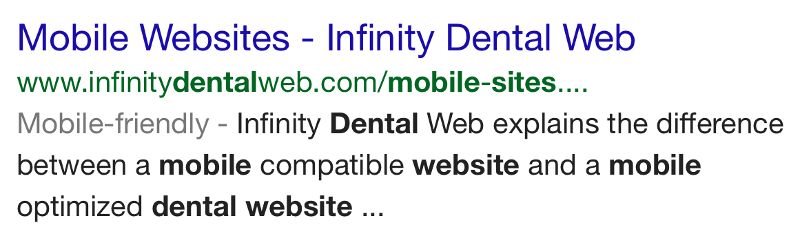 Notice underneath the domain name www.infinitydentalweb.com it clearly shows “Mobile-friendly” for the search result. This provides a clear and simple indicator to mobile users that when they go to this link, the website will properly appear on their device in a way that is easy to use from a mobile device. Lets now contrast that to search results where the resulting website is not mobile-friendly:
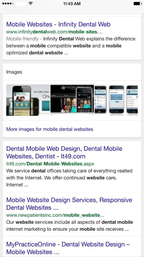
The first result shows a link that would send you to a website that has been designed to work properly when viewed from a mobile device. The remaining results are for websites that are not mobile friendly. Notice that only the first result carries the label “Mobile-friendly” while the other results do not. This has the potential to greatly improve the click-through-ratio (CTR) of the sites that show that they are mobile friendly. Mobile users will begin to notice and look for this mobile friendly label when doing searches and will tend to avoid websites that are not designed with mobile users in mind. This should give a significant boost to websites that have this label, at the expense of the websites that do not.
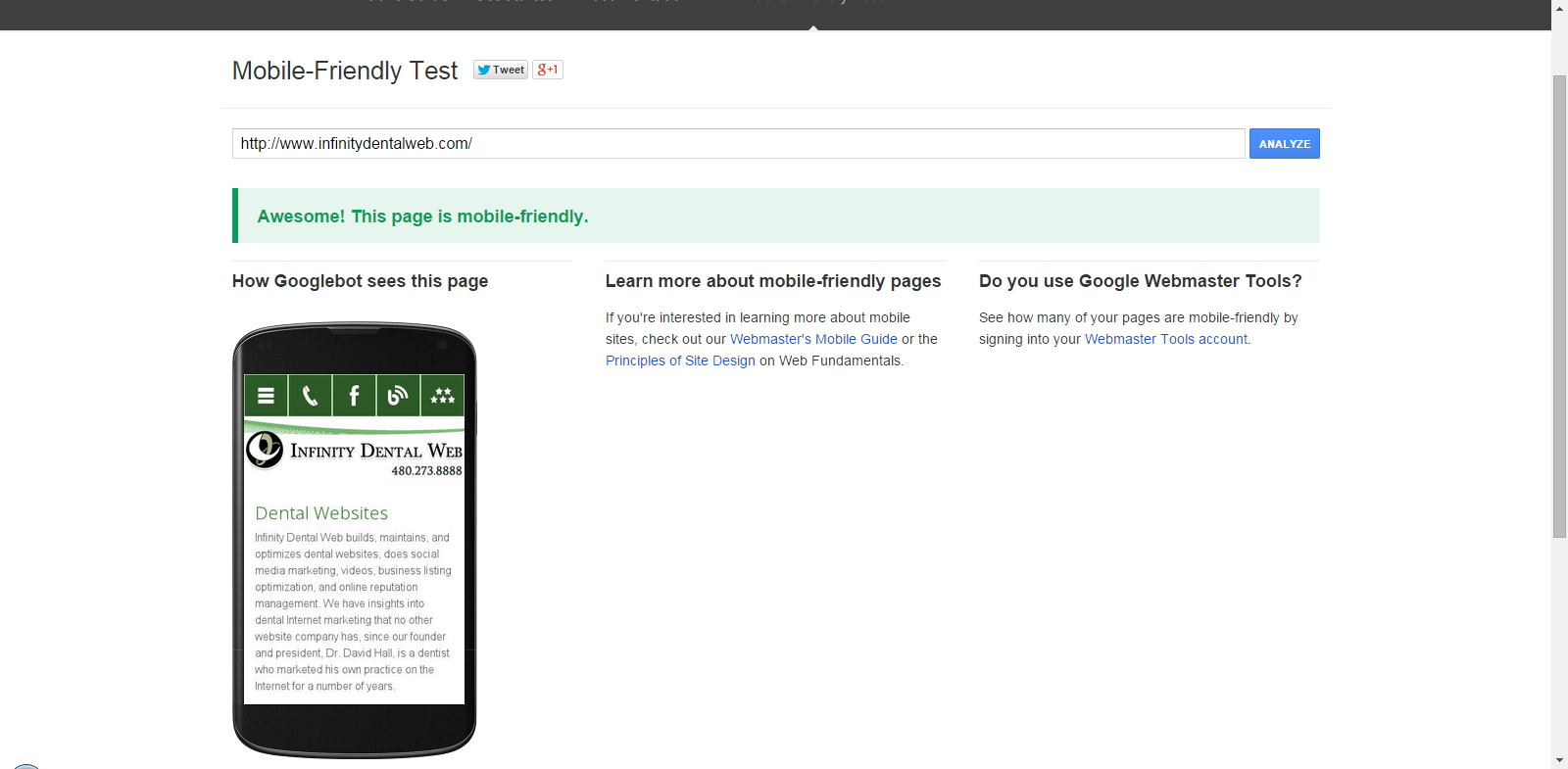
Google also published a link to a tool that can be used to judge how “Mobile-friendly” a website is simply by typing or pasting the link into their Mobile-Friendly Test tool. The tool is very easy to use. You simply enter the URL of the website that you would like to test and then click on the “Analyze” button. Here is a sample of what you might see:
According to an article at searchenginewatch.com, mobile users are 5 times more likely to abandon what they were trying to do when they go to a site that is not mobile friendly. And if you still need further convincing, the article also includes many other statistics that should reveal the advantages of having a mobile responsive website and the disadvantages of not having one. I came across another neat tool earlier this month as well. It is a website that will record a 5 minute video of someone using your mobile website and send you the video. The site is called Peek. The video can be interesting and quite amusing. It can also be quite revealing to see the difficulties that people have from a usability standpoint when trying to use your website, especially if it is not mobile friendly or could use some additional optimization to increase its mobile functionality.
We have blogged several times in the past about what the key components are to having a successful responsive mobile design and of the benefits of your website being mobile friendly. Don’t miss out on all of the potential web visitors that are currently leaving your site the moment that they get there because of the poor user experience they are having. Make your website invite and welcome mobile internet users. You will not be sorry that you did.
 Director of Search Engine Optimization and pay-per-click at Infinity Dental Web. Prior experience in network/server administration, and small business/entrepreneurship.
BS in Business, A+ Certification, former Cisco CCNA certification, and associates degree in computer maintenance and repair.
Director of Search Engine Optimization and pay-per-click at Infinity Dental Web. Prior experience in network/server administration, and small business/entrepreneurship.
BS in Business, A+ Certification, former Cisco CCNA certification, and associates degree in computer maintenance and repair.
Leave a Reply