Mobile Websites: To Redirect or Respond, that is the question…
Date: December 18, 2012Category: Author: Infinity Dental Web
Let’s get one thing out of the way, because you’ve heard it a thousand times now. You need a mobile website. More and more people are browsing their smartphones and tablets for anything and everything. We all want a world of information at our fingertips. However, like any new technology or advancement, there are often different schools of thought emerging regarding the best way to harness this new medium. With hundreds of varying screen resolutions it can be difficult to optimize entirely for every device, which has lead to the development of several methods of creating mobile websites. The language we use here at Infinity Dental Web is the jQuery Mobile Framework. Another emerging language is one developed by Twitter called Bootstrap. These languages are a scaffolding that re-size in accordance to the screen resolution where the site is being displayed.
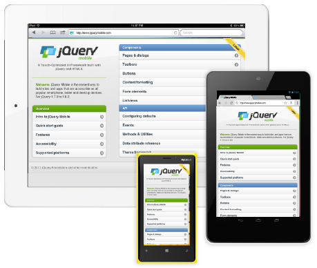
There are different languages to use to create a mobile website, but one of the more interesting conflicting ideas out there at the moment is whether to have a completely separate mobile website or not. This has lead to two basic ideas regarding how a user arrives at the mobile version of your website. The strategy we use for our clients is a method of harnessing a growing mobile database to detect when a mobile user has reached our site, then redirecting those users to a sub-domain where the mobile design has been designed, implemented, and specifically optimized.
The benefits of the redirection approach are the ability to optimize, pare down, and freely redesign the look and content of your main website in it’s new location. This method is not only used by us, but also many other large companies and brands. Visit Facebook, eBay, or Twitter, and you will be redirected to a sub-domain on your mobile device. The ability to refocus our content according to what mobile users are more likely searching for on a mobile device is one of the main reasons we use this method. However, there are a few shortcomings with this game plan as well. With two separate websites it creates more maintenance as the content has to be updated in both places. Also, managing and implementing the redirection code and mobile database can be both time consuming and technically challenging.
These technical hoops that must be jumped through when using the redirection method are probably the impetus for the new movement towards entirely responsive websites. The new Twitter Bootstrap scaffolding appears to have been developed with this idea in mind. With this technique, one would simply build their main website with a completely responsive design, so that the developer would circumvent any need for redirecting, as the mobile version of the site is the main version of the site. This method has its benefits and pitfalls as well. There are fewer hoops to jump through, all the content is edited in one place, there is no database that needs to be updated with new mobile devices, and overall there is less maintenance. However, this method requires much more upfront work, developing a site that is visually pleasing on a 24 inch monitor all the way down to a 3 inch mobile display. It is also impossible to target a different audience on your mobile site, and lastly you may just be attached to your current desktop website and don’t want to scrap it for an entirely new design.
Leave a Reply