


A Mobile Responsive Website is a Dentist’s Best Friend
March 3, 2016 - David Hall
Category: Marketing,Mobile Websites
Smartphones and tablets are ubiquitous, while desktop and even laptop computers have seen a steady decline in usership.
As Angela Moscaritolo points out, PC sales declined in 2015 by 10 percent year-on-year, which made 2015 the worst year in history for PC’s sales.
More important—from a website and ecommerce stand point—is that more than half of consumer web traffic is now from mobile devices.
As mobile devices seize the reins as the preferred browsing tool of consumers, it’s important to fully optimize websites for mobile use. If you don’t, you risk losing out on potential customers and potential revenue.
How do we optimize our mobile response websites to serve mobile users?
The best and most obvious place to begin is with a good design.
A good, mobile-friendly design includes many facets, but in general is viewable and functional at all common screen sizes. It provides a clear and concise user experience, and is optimized to reduce load times.
Past solutions for view-ability and functionality included redirecting mobile users to a separate site or subdomain scaled and designed specifically for mobile users. These sites are easily identified by an “m.” before the website address—in lieu of http. This approach ultimately experienced drawbacks, and is no longer a best practice.
Most developers agree that having one website that scales from full PC size to smaller mobile device size dynamically is best.
Each element type—embedded media, images, text and clickable areas—poses its own challenges that for consideration during optimization. Flash for instance, is not mobile friendly, leading developers to use HTML5 elements instead when adding animation.
Menus, buttons, and clickable elements on the other hand, need special attention when scaling to ensure they remain usable. Buttons that are appropriately sized and easy to click with a mouse on a PC, can quickly become too small and impossible to click with fingertips when scaled down to mobile screen sizes. Experts agree that fonts no less than 14 point and buttons no less than 44 pixels by 44 pixels are best for usability on the small screen.
Scaling between PC sizes and mobile sizes properly can be tricky and often requires extensive testing on multiple browsers and devices to achieve.
User experience, although an important consideration for all websites, is an especially important consideration on mobile sites.
A good user interface should be clearly laid out and simple for customers to navigate.
Google advocates requiring as few steps as possible from the landing page to task completion. Keep menus, buttons, and other calls-to-action, visible, descriptive, and operational.
For example, if your dental website’s goal is for a perspective patient to make an appointment, then we’ll feature your “request an appointment” button prominently on all pages, and ensure it’s easily clickable at all screen sizes. Likewise, menus and submenus need to be easily accessible and functional across user platforms.
Achieving a good user interface, just like with view-ability, requires testing but the time spent upfront is well worth it.
Site size and loading speed are important.
The consequences of slow loading site can be devastating. A few second delay in your website’s loading time leads to lost site visitors—and therefore the loss of potential new patients. In general, large, bloated sites lag when loading on mobile devices, despite technology’s rapid progression.
Check out this infographic from Kissmetrics showing the relationship between loading time and site abandonment.
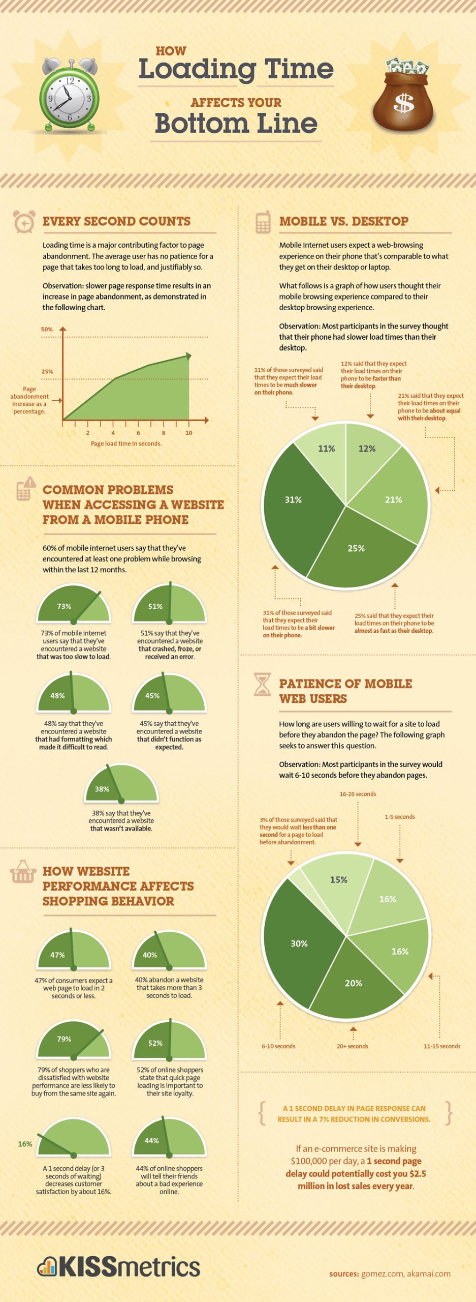
People give up and move on quickly if your site doesn’t load within the first few seconds.
What slows sites down?
The biggest culprits in a bloated and slow website include un-optimized images and embedded media. Surprisingly, using non-standard fonts can also contribute to extended load times, as your browser’s forced to make additional requests to retrieve necessary files. Third-party advertising also significantly adds to lagging loading experiencing.
At the risk of sounding like a broken record, as with other optimization goals, testing is key.
Embracing mobile users is a must in today’s marketplace. Embracing mobile users means a well optimized website. Creating a website that combines all elements for a good mobile user experience can be tricky, but the time and money invested are well worth it.